Hello folks 👋, hope you are doing well.
Today we are going to learn, How we can setup Angular Material in Angular 10 app.
Wait! but why?
Well, To give you few reasons why Angular Material is a great choice,
- Follows Material Design, learn more here.
- Build by Angular Team ❤.
- Well maintained & thorough documentation, find here.
- Feature rich i.e. theme support, internationalized, straightforward APIs etc.
Okay, You get it now. Let’s witness what I just said with an example. You will be amazed 😉
Environment #
- @angular-cli ⇒ v10.1.2 (if you don’t have it, run npm install -g @angular/cli)
Agenda #
- Setup Angular project
- Setup Angular Material
- Let’s create a simple page
- Support for multiple theme
- Application walk-through
Setup Angular project #
1. Create a new Angular project with command ⇒ ng new angular-material-example
2. Make sure you choose SCSS for style.
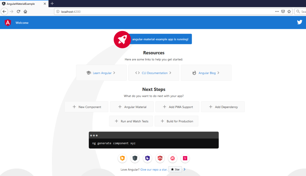
3. Open your project and check once if it’s working fine using ⇒ npm start or ng serve
4. You should see below page on https://localhost:4200,
Setup Angular Material #
1. Seems like it’s working fine. Now let’s setup Angular Material. FYI, we are following steps from this page.
2. Add angular material to the project using, ng add @angular/material
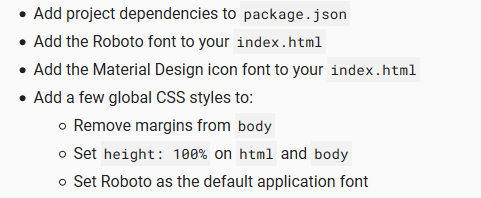
3. It will install Angular Material, CDK, Angular Animations and setup some extra features like theme based on your answers.
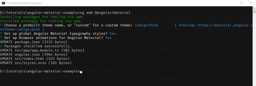
4. This command will additionally perform following configurations as you can see in terminal below,
5. Learn more about schematics here.
Let’s create a simple page #
1. First of all, Clear the whole app.component.html file, so that we can start with empty canvas 😉
2. Now, copy paste following code in respective files.
3. app.module.ts 👇
import { BrowserModule } from '@angular/platform-browser';
import { CUSTOM_ELEMENTS_SCHEMA, NgModule } from '@angular/core';

import { AppRoutingModule } from './app-routing.module';
import { AppComponent } from './app.component';
import { BrowserAnimationsModule } from '@angular/platform-browser/animations';

// Angular Material imports
import { MatToolbarModule } from '@angular/material/toolbar'
import { MatButtonModule } from '@angular/material/button';
import { MatIconModule } from '@angular/material/icon';
import { MatTooltipModule } from '@angular/material/tooltip';
import { MatGridListModule } from '@angular/material/grid-list';
import { MatCardModule } from '@angular/material/card';
import { MatDatepickerModule } from '@angular/material/datepicker';
import { MatFormFieldModule } from '@angular/material/form-field';
import { MatNativeDateModule } from '@angular/material/core';

@NgModule({
  declarations: [
    AppComponent
  ],
  imports: [
    BrowserModule,
    AppRoutingModule,
    BrowserAnimationsModule,

    MatToolbarModule,
    MatButtonModule,
    MatIconModule,
    MatTooltipModule,
    MatGridListModule,
    MatCardModule,
    MatDatepickerModule,
    MatNativeDateModule,
    MatFormFieldModule
  ],
  providers: [],
  bootstrap: [AppComponent],
  schemas: [
    CUSTOM_ELEMENTS_SCHEMA
  ]
})
export class AppModule { }
4. app.component.html 👇
<!-- This wrapper is necessary for applying multiple themes -->
<div class="mat-app-background">

  <!-- Toolbar -->
  <mat-toolbar color="primary">
    <span class="toolbar">Angular Material Examples</span>
    <a mat-icon-button
      matTooltip="Github project"
      aria-label="Example icon-button with heart icon"
      href="https://github.com/indrajitbnikam/angular-material-example"
      target="_blank">
      <mat-icon>code</mat-icon>
    </a>
    <button mat-icon-button
      matTooltip="Toggle theme"
      aria-label="Example icon-button with share icon" (click)="toggleTheme()">
      <mat-icon>invert_colors</mat-icon>
    </button>
  </mat-toolbar>

  <!-- Content -->
  <div class="content">

    <!-- Card -->
    <div class="component">
      <p class="title">
        Card
      </p>
      <div class="demo">
        <mat-card class="card">
          <mat-card-header>
            <div mat-card-avatar class="card-header-image"></div>
            <mat-card-title>Shiba Inu</mat-card-title>
            <mat-card-subtitle>Dog Breed</mat-card-subtitle>
          </mat-card-header>
          <img mat-card-image src="https://material.angular.io/assets/img/examples/shiba2.jpg" alt="Photo of a Shiba Inu">
          <mat-card-content>
            <p>
              The Shiba Inu is the smallest of the six original and distinct spitz breeds of dog from Japan.
              A small, agile dog that copes very well with mountainous terrain, the Shiba Inu was originally
              bred for hunting.
            </p>
          </mat-card-content>
          <mat-card-actions>
            <button mat-button>LIKE</button>
            <button mat-button>SHARE</button>
          </mat-card-actions>
        </mat-card>
      </div>
    </div>

    <!-- Date picker -->
    <div class="component">
      <p class="title">
        Date picker
      </p>
      <div class="demo">
        <mat-form-field appearance="fill">
          <mat-label>Enter a date range</mat-label>
          <mat-date-range-input [rangePicker]="picker">
            <input matStartDate placeholder="Start date">
            <input matEndDate placeholder="End date">
          </mat-date-range-input>
          <mat-datepicker-toggle matSuffix [for]="picker"></mat-datepicker-toggle>
          <mat-date-range-picker #picker></mat-date-range-picker>
        </mat-form-field>
      </div>
    </div>

    <!-- Grid List -->
    <div class="component">
      <p class="title">
        Grid List
      </p>
      <div class="demo">
        <div style="width: 100%;">
          <mat-grid-list cols="3">
            <mat-grid-tile>1</mat-grid-tile>
            <mat-grid-tile>2</mat-grid-tile>
            <mat-grid-tile>3</mat-grid-tile>
          </mat-grid-list>
        </div>
      </div>
    </div>

    <div class="for-more">
      <p>For more, visit angular material docs 👉
        <a mat-button color="primary" href="https://material.angular.io/components/categories" target="_blank">here</a>
      </p>
    </div>
  </div>
</div>
5. app.component.scss 👇
.toolbar {
  flex: 1 1 auto;
  text-align: center;
}

.content {
  width: 90%;
  margin: 0 auto;
  margin-top: 20px;
  padding-bottom: 20px;

  &>*:not(:last-child) {
    margin-bottom: 20px;
  }

  .component {
    height: 100%;
    padding: 20px;
    border-radius: 20px;
    border: 1px solid rgba(0, 0, 0, 0.116);

    .title {
      font-size: 20px;
      font-weight: 300;
      border-left: 4px solid goldenrod;
      padding: 5px;
    }

    .demo {
      display: grid;
      place-items: center;
    }
  }
}

// Grid
mat-grid-tile {
  background: lightblue;
}

// Card
.card {
  max-width: 400px;
}

.card-header-image {
  background-image: url('https://material.angular.io/assets/img/examples/shiba1.jpg');
  background-size: cover;
}

.for-more {
  width: 100%;
  text-align: center;
  font-size: larger;
  margin-bottom: 20px;
}
6. app.component.ts 👇
import { Component, ElementRef } from '@angular/core';
import { OverlayContainer } from '@angular/cdk/overlay';

@Component({
  selector: 'app-root',
  templateUrl: './app.component.html',
  styleUrls: ['./app.component.scss']
})
export class AppComponent {
  isDarkTheme = false;

  constructor(private _overlay: OverlayContainer, private _elementRef: ElementRef) {

  }

  // Dynamically adds/removes class to parent container to apply different theme at runtime
  toggleTheme() {
    this.isDarkTheme = !this.isDarkTheme;
    if (this.isDarkTheme) {
      this._elementRef.nativeElement.classList.add('dark-theme');
      this._overlay.getContainerElement().classList.add('dark-theme');
    } else {
      this._elementRef.nativeElement.classList.remove('dark-theme');
      this._overlay.getContainerElement().classList.remove('dark-theme');
    }
  }
}
7. As you can see in app.component.ts file, we have added partially functionality to toggle the theme. To fully implement it, let’s jump in to next section.
Support for multiple theme #
1. In order to provide multiple theme support we have to add following code at the end of styles.scss,
// Existing content of file 👆
// Newly added content👇

@import '~@angular/material/theming';
// Plus imports for other components in your app.

// Include the common styles for Angular Material. We include this here so that you only
// have to load a single css file for Angular Material in your app.
// **Be sure that you only ever include this mixin once!**
@include mat-core();

// Define the default theme (same as the example above).
$light-primary: mat-palette($mat-indigo);
$light-accent:  mat-palette($mat-pink, A200, A100, A400);
$light-theme:   mat-light-theme((
  color: (
    primary: $light-primary,
    accent: $light-accent,
  )
));

// Include the default theme styles (color and default density)
@include angular-material-theme($light-theme);


// Define an alternate dark theme.
$dark-primary: mat-palette($mat-blue-grey);
$dark-accent:  mat-palette($mat-amber, A200, A100, A400);
$dark-warn:    mat-palette($mat-deep-orange);
$dark-theme:   mat-dark-theme((
  color: (
    primary: $dark-primary,
    accent: $dark-accent,
    warn: $dark-warn,
  )
));

// Include the dark color styles inside of a block with a CSS class. You can make this
// CSS class whatever you want. In this example, any component inside of an element with
// `.unicorn-dark-theme` will be affected by this alternate dark theme instead of the default theme.
.dark-theme {
  @include angular-material-color($dark-theme);
}
2. And, we are done with theming as well. You can add as many themes as you want just like dark theme above.
Application walk through #
I know, at this point you must be thinking like. Dude, I’ve been copy pasting code for like forever. What did we achieve so far?
Let’s discuss that. Fire up our little application with npm start and visit => https://localhost:4200/
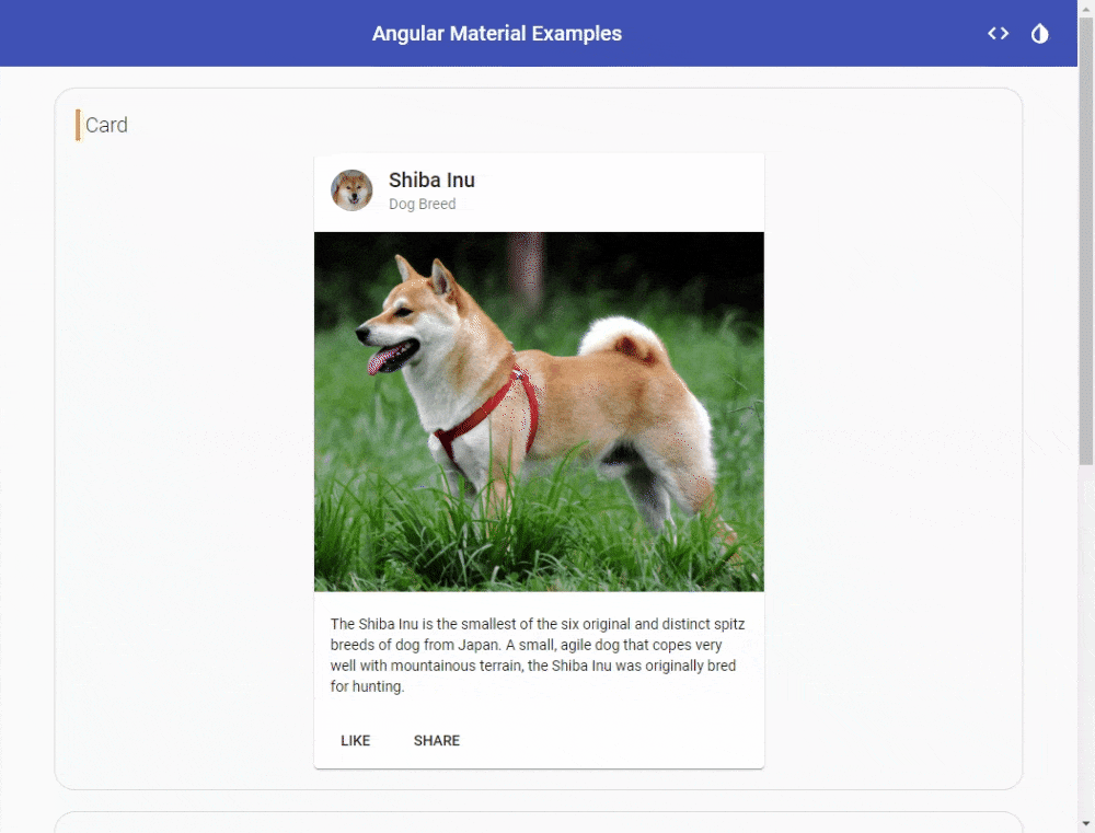
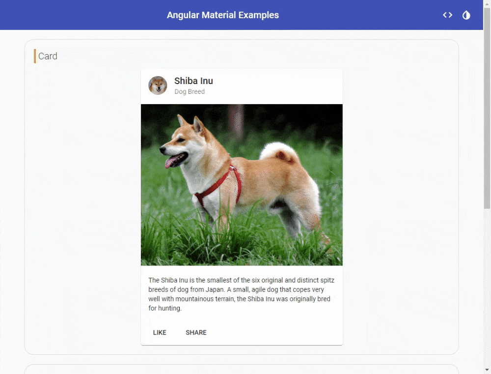
We used Angular material component in our app!
You can see Range Date-picker component in action in GIF below, we have also used some other components as well.
We configured multiple theme support!
Since we have configured light/dark theme in our app, we can effortlessly switch between those in real time.
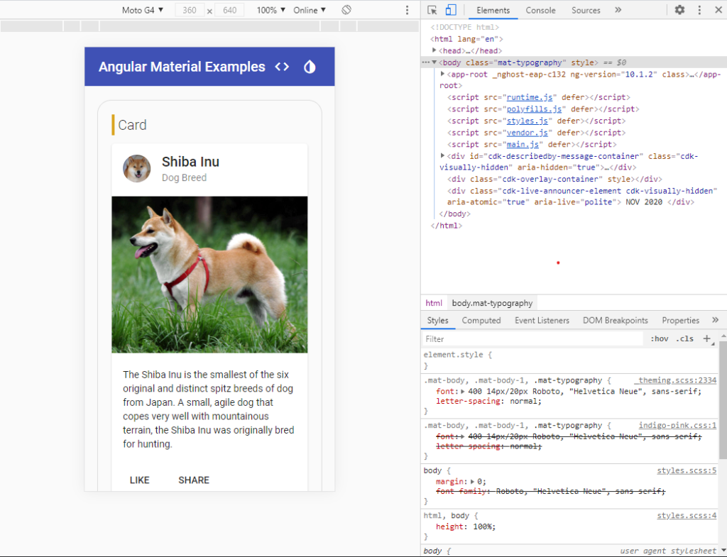
We, sorry Angular Material! made our app responsive 😉
We haven’t added even a single line to make our app responsive so far, but look at our app in mobile(Portrait view).
Whoosh 😪, seems like we have done quite well in such a little time. Hurray 🥳🥳🥳. Well, that’s the beauty of using a mature UI Control library like Angular Material.
Scope of this blog was pretty limited, so we have not touched CDK. It’s pretty cool, so may be next time 🤘
Checkout live demo here 🚀
For reference code, visit my Github repository here.
For more info on Angular Material visit this site.
Hope you enjoyed it. Share it if you liked it 😉
For more such content click here.
Take care and keep learning 😎✌